Following this guide, you can easily create engaging social media design. Today, If you’re passing a billboard, watching TV, or browsing the internet, flipping through a magazine. Everywhere, we see the content. But does anyone remembers anything about it? When scrolling down your social media profile, do you know what the advertisement was for?
Chances of that happening are if it didn’t attract your attention, then you might not notice it. For your brand, the right thing to do is to produce content that not only stands out but is attractive visually. And the right way to get it done? Using our 10 tips on graphic design for social media.
Let’s dive into these 10 tips for your social media graphic design so that we can ensure that your social media content is not only entertaining but also made of all elements to deliver memorable experiences.
Contents
10 Tips for Social Media Graphic Design
1. Pick Your Purpose

When designing social media posts, the first and most important of the graphic design tips is that you need to have a purpose. In designing your template for your social media content, putting up a target would be the foundation. So let’s find out what you’re going to do and then let’s make it a narrative.
Getting a target would not only improve your social media content creation, but it will also allow you to visually express your message. Start by answering a few questions about yourself:
- What reason do I have for this post?
- Am I going to continue to drive sales?
- Do I want to boost my website’s traffic?
- Am I going to get my website more connected?
Have the target audience in mind when answering these questions. Take care that you are mindful of who the audience is. Study the competitors and your perfect target demographic. When targeting the audience, here are some analysis points to consider:
- That’s who they are?
- What tools are they using?
- Are they desktop users or users with cell phones?
- What message would I want to convey?
- How do I want to make my audience sound and what do I want them to do with it?
- What do they like/ who do they follow?
- Where are they hanging out?
You’ll have your focus until you know your audience, who you want to reach, and the objective of your message. The first and most crucial step in this whole process is your “WHY” for making your social media graphic. To represent this purpose, everything will be chosen after this.
It is also good to remember that while goals are significant, too many goals will trigger a busy graphic. Too much text, photographs, or fonts will turn the viewers off immediately. But now that we’ve got the first graphic design tips down, let’s move on to color.
2. Colour
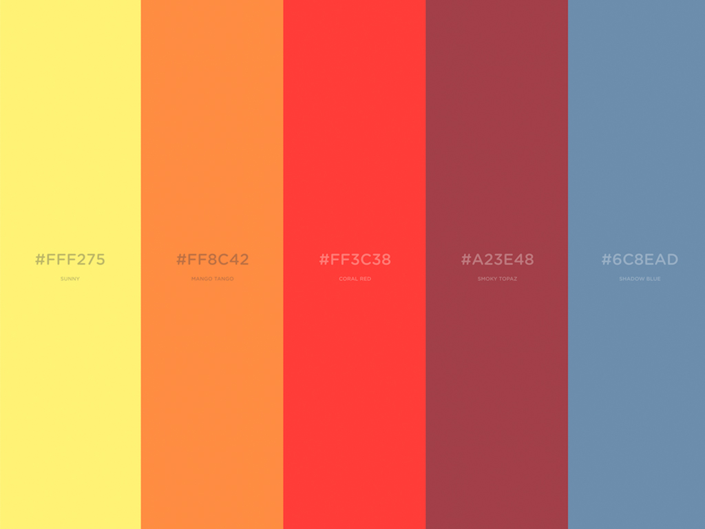
Color is one of the most critical elements of any kind of design. It helps to set the tone, to build the feeling, and also to trigger feelings. Finding a color scheme that conveys the emotion you want your audience or brand to identify with it with each color having sense and psychology behind it can help to create continuity.
And what is the brand supposed to stand for? Is it exciting, proven, trustworthy, etc.? You want to select colors that show what your brand stands for and by beginning with two to three key colors, you can do that. It’s key to the quality of a design to find the color style. Do you remember the purpose you just discovered? Well, understanding that using colors in your social media posts can be helpful as this will direct the audience through the post.
When you have selected color scheme, assure you use the same colors in all posts. Specify the hex codes so that you have the same color. The last thing you want to do is to make posts a hue or two (unless they are deliberate, i.e. monochromatic) off. You will find the exact color of the picture using any color picker app that offers you a six-digit code that defines the exact color on the color wheel.
Color plays a vital role in the final production of the overall graphic design for social media. As described earlier, color influences the psychology, feelings, and reactions of an individual to a design. It is therefore important to select the correct kind of color scheme that will generate the correct type of reactions from your audiences.
3. Text

Not to be mistaken which we will get into next with typography. The text is a series of words, while the graphic art of the written word is typography. Now that we have outlined that, let us get into why it’s useful to set.
We know as an owner that this brand is like your kids. You want to show it off and say it to everyone. You may even feel like you’ve got to use every word you can to describe your brand because it is so amazing. However, you want to refrain from overcrowding a picture when designing social media graphic designs.
More than certainly, on a mobile device, a large share of the content would be consumed. When selecting the font size, keep it in mind. The readability of the text depends largely on the size and color of the text. Moving back to color, it’s nice to use light-colored text with a dark background and vice versa. It’s better to use contrast to make the text stand out, so we’ll discuss it later.
4. Typography

Typography is a skill on its own. Choosing the best font to fit with the visuals can be challenging, but when done correctly, it can bring the graphics to life! Like your color palette, the choice of fonts should represent the style of your company. Don’t go nuts – you only need a limit of two or three fonts. Any further than that and the audience will be confused, and your message will be missed. And they’re not going to have a font to remember them with. You want your fans to be able to see a graphic and know it’s yours even though you don’t have a tag on it.
When selecting font, you want to make sure it expresses right message and represents the brand. Must know that font influences the perception of your design and the meaning that the brand sends. Similar to color, typography may project moods and feelings, often much more effective than a copy. So choose carefully when you choose a font, it’s going to offer your sound.
Few guidelines:
- Serif fonts are the best for printing
- Limit design template to up to 3 fonts
Pair fonts with high contrast when deciding on more than one font. Although also producing the extra ‘Snap’, the fonts will cancel each other out! validate that you don’t use too many fonts, as the retina finds it difficult to scan numerous fonts. Using a font that has edition options, such as italic, bold, simplified, etc., instead.
A basic text comparison that you can use is a serif font and the other font that isn’t. In multiple variants, the picture below displays the same font.
When making social media content, arranging fonts to make text readable and more enticing is important. Confirm that your viewers will finally read your message, whether you want a sans-serif font or a serif font.
5. Contrasts
If this you haven’t learned it before, negative space (also referred to as white space) is a perfect way to make your picture stand out. Contrast draws the eye and can be used for font, colors, alignment, scale, and more.
How do you evaluate the image? The simple way to bring contrast to your graphic design is with the use of colors.
Text is also an integral aspect of contrast. As mentioned above, selecting text sizes that contrast well can help build your graphic display. The components would be able to relax by having a fluid design by covering words with white space. The use of text, forms, and other components across space would make it easy to read the design and also draw more interest than a cluttered design.
6. Visual Identity

So we will focus our attention on brand identity and how to implement branding to elevate the story now that you have the basics of graphic design for social media.
On average it takes someone to see or hear your brand about seven times to identify it. This ensures that the continuity and replication of brand characteristics, such as logo, colors, and fonts, are key.
Verify that your logo is used in every graphic, but keep what we have learned so far in mind. You want people to associate it with your brand but it is too surprising to have half the size or more of the picture. You want to have the logo in your photos.
7. Consistency
A key component of your brand would be consistency. The audience will gain a strong picture of the brand and its message as all your social media content looks and sounds connected. However, if you appear inconsistent and random, your brand or message may be confused to the audience.
Your brand will help you achieve a consistent look early after establishing target audience. Giving fans the ability to recognize you easily on their feeds. Ensure that you agree with brand on all content. Often post content in the same format can also be difficult, but it’s worth being able to recognize a good brand.
Check all the projects are integrated on all platforms while maintaining consistency. These comprehensive elements connect each post and make it instantly visible for your brand!
8. Know your social media image size
Knowing what interacts well for each platform ahead of time will not only benefit the audience creatively but will make it simpler for you in the long run.
Below I listed 5 social networks and provided some tips for each one.
- The older generation is oriented toward
- Requires great use of promotions and posts
Facebook image Size:
cover photo 852 x 315;
profile image 180 x 180;
post 1,200 x 630
- Aimed at Millennials
- Mainly for Lifestyle
Instagram image Size:
1080 x 1080 posts;
1080 x 1920 stories;
1080 x 1350 portraits;
1080 x 566 landscapes;
110 x 110 pixels.
- Superb for interaction
- Amazing for celebrities
Twitter image Size:
photo of header 1500 x 500;
photo of profile 400 x 400;
photo of post 900 x 512
- Best for creativity and fresh thinking
- Good for individuals searching for new merchandise
Image Size on Pinterest:
600 x 1260 pins;
165 x 165 picture profile
- Superb for companies.
- Excellent for teamwork
LinkedIn image Size:
1584 x 396 banner,
400 x 400 profile

Know what’s better for everybody and know that you need to turn every piece of the content into a social media graphic design for the dimensions of each platform you want to post. It may seem time-consuming, but an easy size check might make a big difference.
9. Creative
Whether you accept this or not, creativity is life for everybody. Being imaginative when producing or curating your content will not only help you bring your brand and audience together, it will also make your business stand out from the others.
Build diversity when adding material to the social network. There are a plethora of different styles of graphics that you can post on social media.
Social Media Graphic design ideas to get your inspiration going:
- Post Quotations
- Create Infographics/Diagrams
- Follow Theme days (Motivation Monday, Throwback Thursday, etc.)
Please remember that the social media accounts that are attractive are more likely to be posted and eventually improve interaction. So practice the creative freedom you’ve been retaining within then make sure the ideas are associated with the brand and highlight your products and company.
Do you want to push your creative talents and abilities in the graphic plan to improve? Test something new, think beyond the box, play and choose various fonts and images and mix them and see what happens.
Make an effort to avoid the recent trends and build prototypes that suits your personality, and leave your mark on your task.
10. Keep it simple & straightforward
For all the styles, graphics, and going on, it’s always best practice when in doubt; keep it easy. The most agreed-upon social media graphic design tips are clearly to keep things easy.
When dealing with only a tiny canvas, such as cell phones, overcrowding occurs too easily.
Tips
- Using eye-catching graphics and diagrams
- Restrict the choice of font to 2
- Stay with 2-3 contrast (or ‘personalized’) colors
- Using white space to contrast the bold aspect
It can be easy to get confused and swept away with too many fantastic graphics and fonts to pick from, but by reducing the clumsiness you’re more able to get your message across!
Remember that each style represents the message you’re trying to tell. Simple is still the best thing when it comes to graphic design. By helping to reduce the sloppiness, you are more able to get your idea through!
Perfect! Now that you’re ready to create great, more interactive, and focused graphic designs for your social media content, now you have all your graphic design tips! If you have any graphic design ideas for social media that you would like to share? In the comments, let us know!
Top Social Media Design Tools to create social media designs.
| App | Use | OS |
| Canva | Graphic design | Web, Mobile |
| Adobe Express | Modern designs | Web, Mobile |
| Pablo | Create Posts | Web |
| Desynger | Design anything | Web, Mobile |
| Snappa | Social media posts | Web |
Read: Tips for using social media